Problem Statement for The Cake Fairy logo
The Cake Fairy, a bakery specializing in cakes and bread since 2019, required a logo that would reflect the essence of its brand—whimsy, sweetness, and professionalism. The challenge was to design a visual identity that would not only appeal to customers looking for delightful baked goods but also communicate a sense of craftsmanship and tradition. The design needed to be elegant, memorable, and versatile enough for various branding materials, including packaging, signage, and social media.
Solution
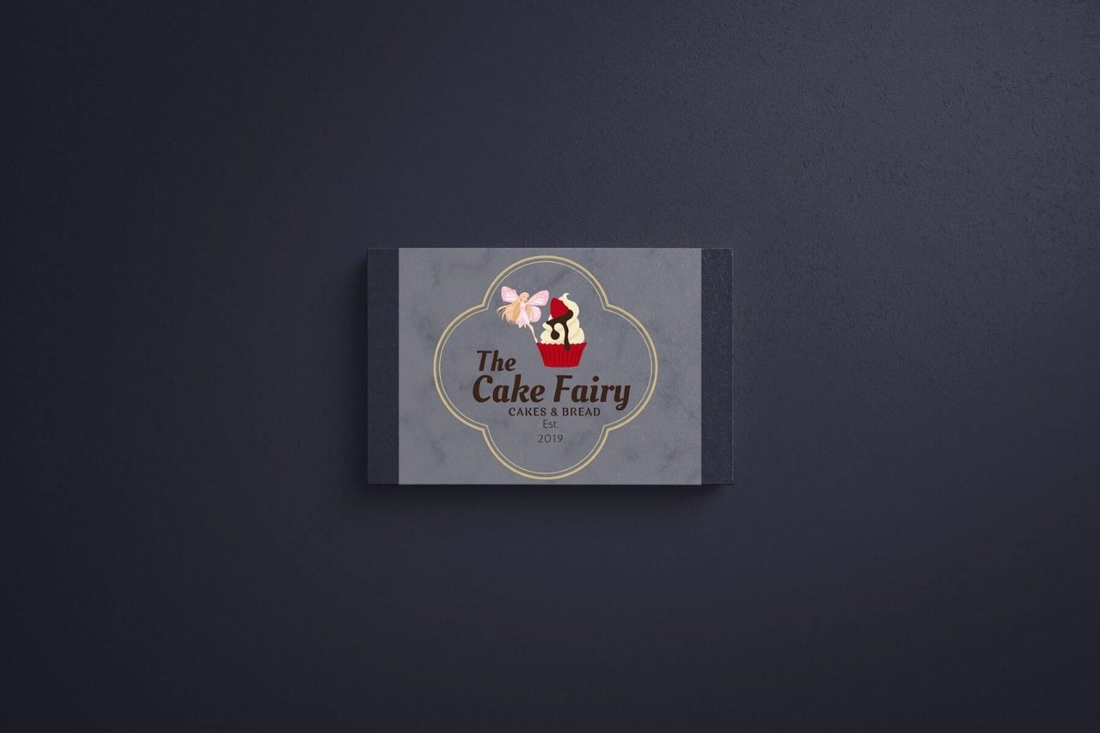
The final logo design captures the brand’s magical theme through the combination of:
- A whimsical fairy illustration alongside a cupcake symbolizes the bakery’s creative and delicious offerings.
- Soft pastel tones and playful elements evoke a sense of sweetness, while the use of gold accents adds a touch of elegance and luxury.
- A clean, circular badge-style layout enhances the versatility of the logo, making it easy to apply across different platforms and products.
- Balanced typography: The mix of elegant cursive for “The Cake Fairy” with straightforward text for “Cakes & Bread” establishes a harmonious blend of playfulness and professionalism.
- The established year (2019) included in the design communicates the bakery’s experience and dedication to quality over time.
The design ensures that the bakery will be easily recognized, appealing to customers who seek high-quality, artisanal baked goods. Whether used on product packaging or digital platforms, the logo reflects The Cake Fairy’s charm, creativity, and dedication to creating delightful treats.


