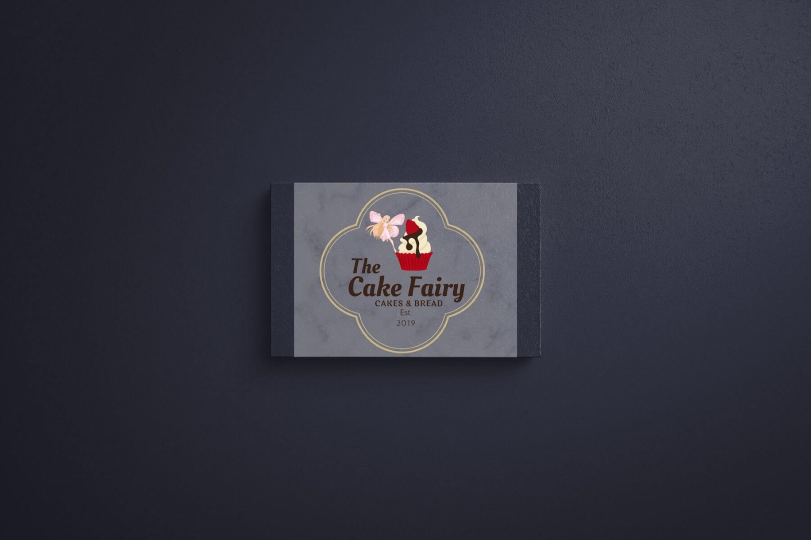
The client wanted a whimsical yet elegant Cake Fairy logo design that reflected the homemade charm and magical essence of their bakery products. Unlike competitors who relied on generic cupcake visuals, the goal was to create something personal, memorable, and story‑like to attract families, kids, and casual gifting customers.
Objectives: The Cake Fairy
- Design a Cake Fairy logo design that combines fantasy (fairy magic) with appetizing visuals (cupcakes and bread).
- Ensure readability and appeal across both print and digital mediums.
- Create a unique, storybook‑like identity that stands out in a competitive bakery market.
- Build trust and authenticity with a timeless design.
Challenges
- Avoiding overused cupcake icons while still conveying bakery sweetness.
- Balancing whimsical fantasy with professional branding credibility.
- Designing a logo versatile enough for packaging, labels, and social media.
Our Approach
- Visual Focus: Illustrated a fairy character paired with a frosted cupcake topped with syrup, placed inside a clover frame.
Color Palette:
- Pastel Pink & Gold Accents → fairy tale charm and femininity.
- Chocolate Brown Text → warmth, comfort, and baked goods.
- Red & Cream for the Cupcake → vibrancy and indulgence.
Typography:
- Elegant serif for “the Cake Fairy” to emphasize brand identity.
- Clean, modern type for “Cakes & Bread” as supportive info.
- Shape & Layout: Clover‑shaped outline for a storybook feel, perfect for die‑cut packaging stickers
- Brand Vibe: Whimsical, Homemade, Family‑Friendly, Magical, Comforting.
Design Features:
- Iconic fairy + cupcake illustration for instant recognition.
- Suitable for packaging, labels, and social media.
- “Est. 2019” included for authenticity and trust.
Results
- Delivered the Cake Fairy logo design that resonated strongly with the target audience.
- Boosted custom cake orders and birthday inquiries.
- Strengthened brand consistency, leading to repeat customers and higher trust.


