
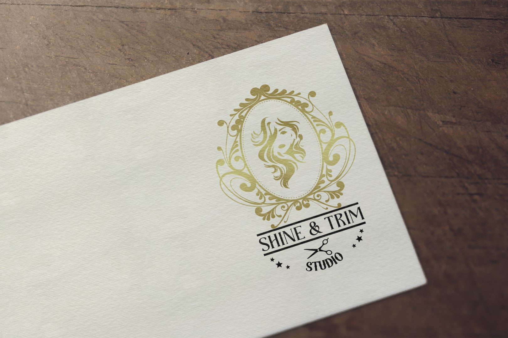
Shine & Trim Studio needed an elegant, feminine logo to reflect its upscale beauty services. The challenge was to create a sophisticated, memorable identity that instantly signals glamour, precision, and boutique care—while remaining versatile across print and digital platforms.
Objectives: Shine and Trim Studio
- Design a Shine and Trim Studio logo that evokes trust, radiance, and high-end styling.
- Communicate femininity, transformation, and artistic beauty.
- Ensure scalability for signage, packaging, and digital use.
Challenges
- Needed to balance ornate elegance with modern clarity.
- Had to appeal to beauty-conscious clientele while remaining professional.
- Required a layout that worked across storefronts, social media, and branding materials.
Our Approach
- Visual Elements:
- Stylized silhouette of a woman with flowing hair to symbolize grace and transformation.
- Ornate golden frame for vintage charm and visual anchoring.
- Scissors motif below text to associate with salon services.
- Circular emblem layout to suggest unity and balance.
- Typography:
- Sophisticated serif for “SHINE and TRIM” to combine elegance and readability.
- Curved, playful script for “STUDIO” to add warmth and creativity.
- Color Palette:
- Classic gold and ivory textures for opulence and timeless beauty.
- Neutral background with natural light contrast for premium feel.
- Final Design Features:
- Symmetrical composition ideal for both large signage and small branding materials.
- Feminine, refined tone balanced with professional styling cues.
- Easily recognizable brand identity to attract beauty-conscious clientele.
Results: Shine and Trim Studio
- The Shine and Trim Studio logo design helped establish a distinctive presence in a competitive beauty market.
- Became a central element in cultivating brand loyalty and communicating quality aesthetics.
- Successfully unified storefront, packaging, and digital branding.
