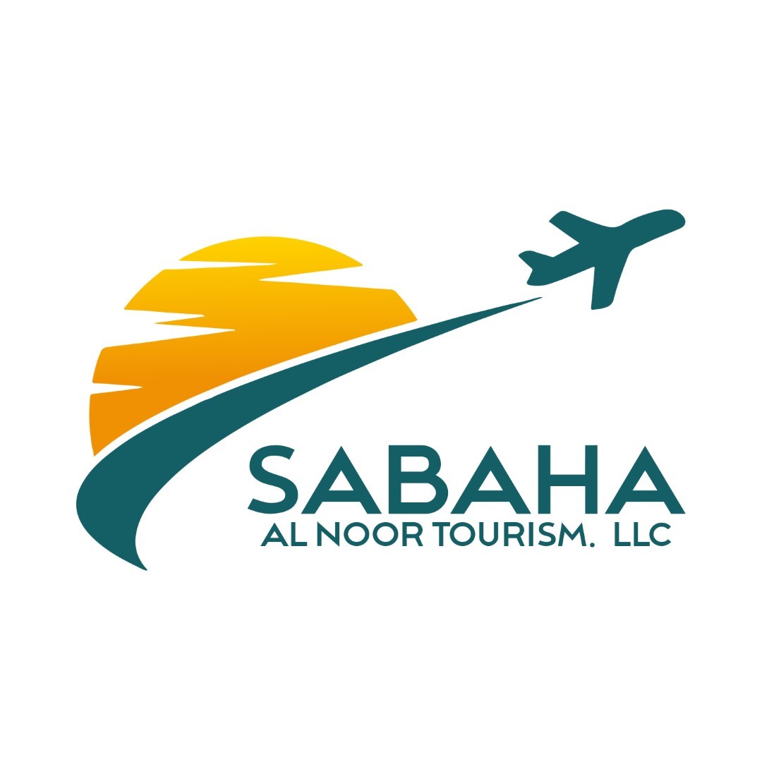
Sabaha Al Noor Tourism needed a modern and vibrant logo that could represent a trustworthy and adventurous tourism brand. The challenge was to appeal to both local and international travelers while reflecting professionalism, sunrise optimism, and seamless travel experiences.
Objectives
- Create a Sabaha Al Noor logo design that conveys morning freshness and new journeys.
- Integrate air travel and tourism elements for instant recognition
- Ensure a modern, professional look suitable for both online and offline branding.
- Build a scalable identity adaptable for signage, digital platforms, and print.
Challenges
- Previous branding lacked uniqueness and failed to connect emotionally with travelers.
- Needed to balance vibrancy with professionalism.
- The logo had to be versatile for multiple applications, from social media to outdoor signage.
Our Approach
Visual Elements:
- Stylized sunrise to represent morning energy, optimism, and hope.
- An airplane in motion symbolizes international travel, freedom, and smooth service.
- Pathway/curve to suggest guided tours, upward movement, and seamless transitions.
Typography:
- Bold sans‑serif font for “SABAHA” to project strength and clarity.
- Slim, clean subtext for “AL NOOR TOURISM, LLC” for readability and contrast.
Color Palette:
- Sunset Yellow & Orange → energy, optimism, adventure.
- Teal/Dark Green → trust, reliability, professionalism.
Design Features:
- Balanced composition between icon and text.
- Scalable for all brand formats (mobile, print, outdoor).
- Modern, minimal yet expressive look that resonates with travel lovers.
Results
- Delivered a Sabaha Al Noor logo design that elevated the brand’s presence on social media and business platforms.
- Became central to their marketing assets, creating consistency across all touchpoints.
- Helped position Sabaha Al Noor Tourism as a professional and trustworthy brand in Dubai’s competitive tourism market.


