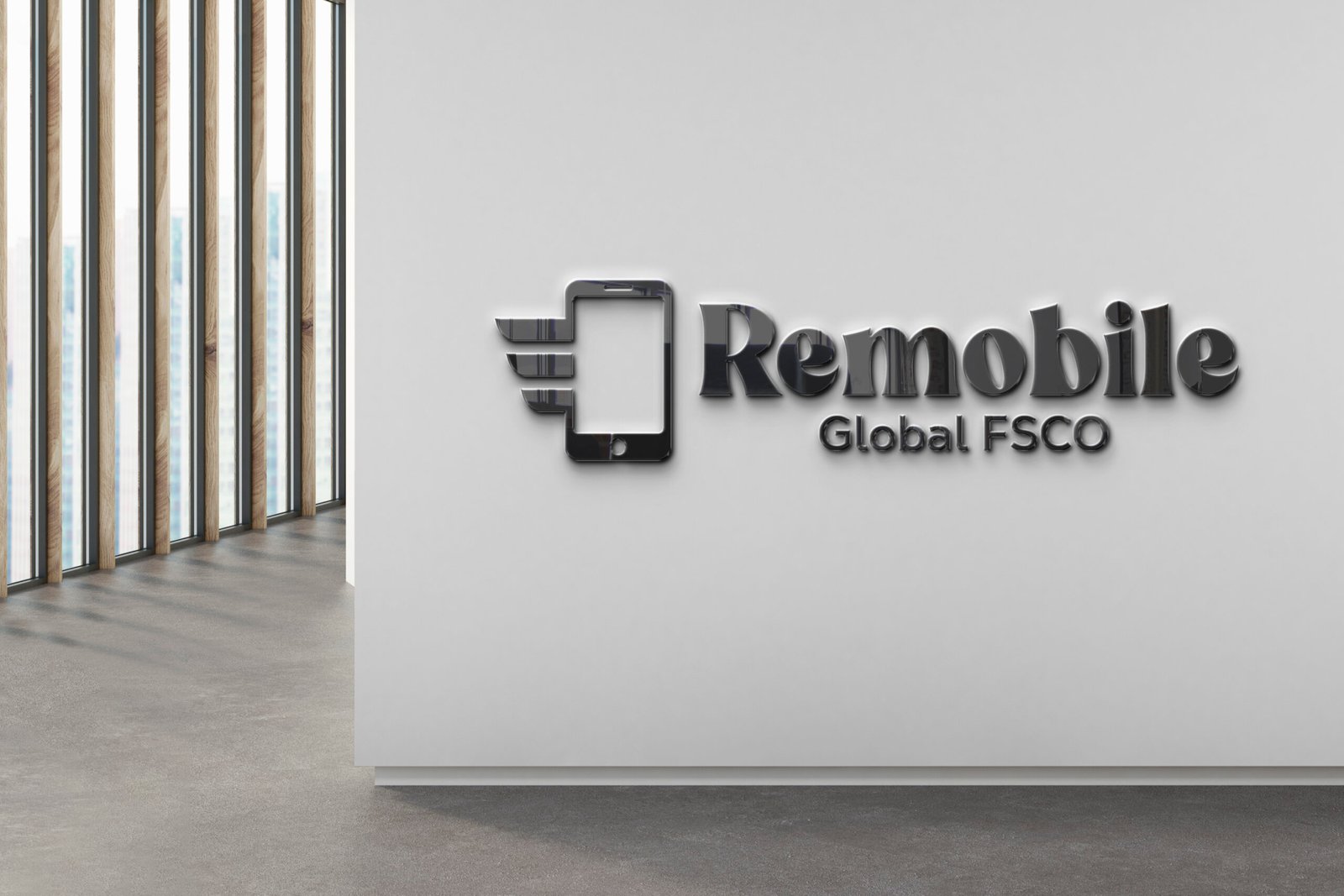
Problem Statement for Remobile logo design:
The client needed a sleek and modern Remobile brand identity to represent their forward-thinking mobile solutions. The design had to convey innovation, digital mobility, and global connectivity, while maintaining corporate professionalism suitable for both tech audiences and enterprise partners.
Objective:
Create a visually striking logo that communicates:
- A commitment to mobile-first solutions
- Global outreach and network reliability
- A polished, scalable identity for cross-platform use
Design Strategy:
Visual Elements:
- Stylized Smartphone Emblem with Motion Lines: Suggests fast communication, movement, and tech-forward innovation
- Sleek Metallic Finish: Elevates the logo for high-end corporate environments
- “Remobile” in Bold Typography: Anchors brand recognition with confidence and clarity
- “Global FSCO” Subtext: Adds sophistication and defines the company’s global scope
Typography:
- Clean, Strong Sans Serif Font: Reflects modernity and trust
- Subtle Contrast Between Brand Name & Descriptor: Maintains focus while supporting readability
Color Palette:
- Brushed Metallics with Monochrome Backdrop: Offers a high-tech, premium feel
- Natural Light Integration in Presentation: Used to enhance real-world depth and presence
Final Design Features:
- High-end aesthetic is ideal for both screen and architectural branding
- Professional scalability across mobile icons, signage, and digital media
- Composition that blends minimalism with memorable visual impact
Results for Remobile logo:
This visual identity helped Remobile establish a strong market presence, presenting itself as an agile, future-facing telecom brand. The design served as a cornerstone for brand trust in both B2B and customer-focused environments.


