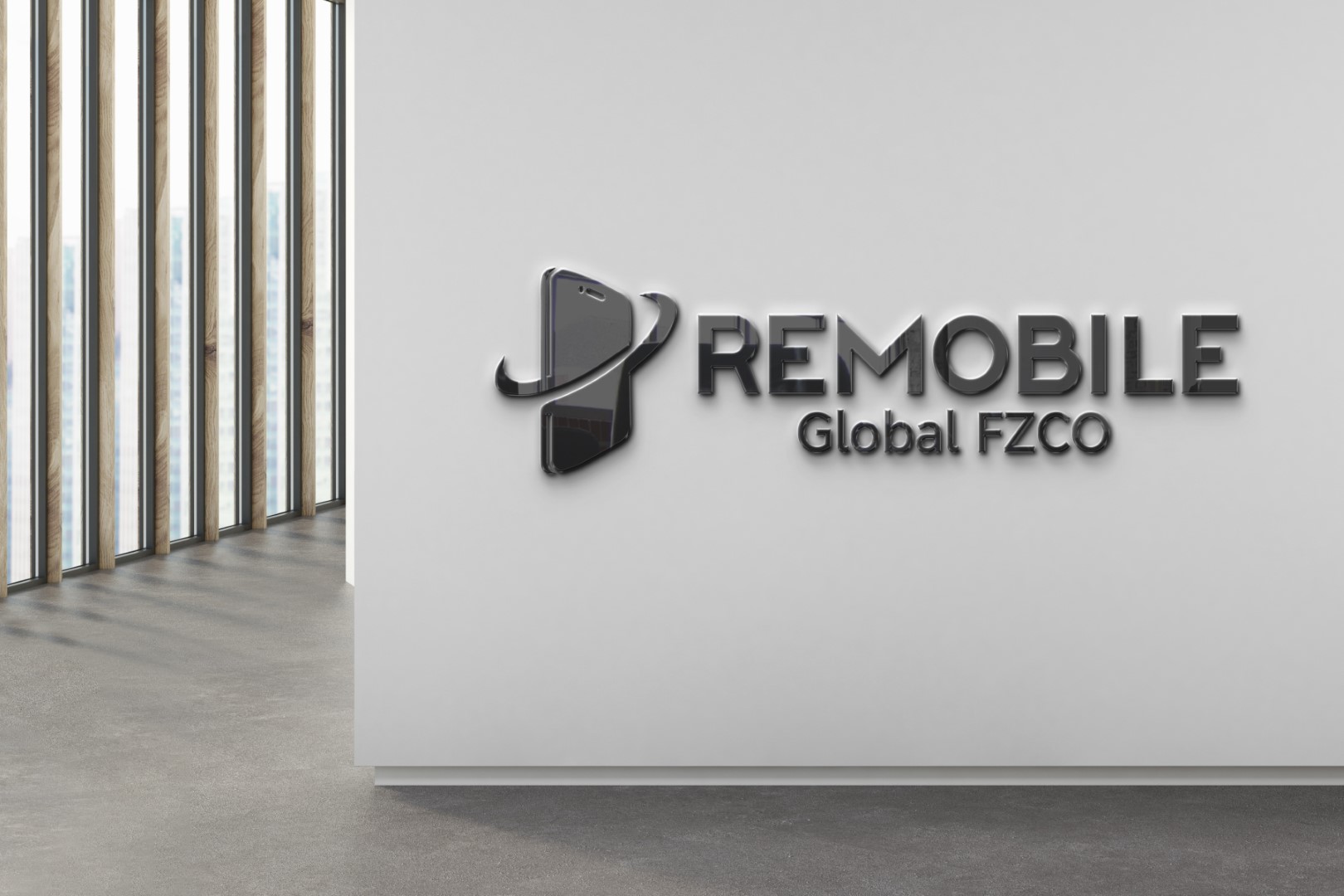
Remobile Global FSCO needed a sleek and modern brand identity to represent its mobile-first solutions. The challenge was to convey innovation, digital mobility, and global connectivity while maintaining corporate professionalism for both tech audiences and enterprise partners.
Objectives
- Design a Remobile Global FSCO logo that reflects mobile-first innovation.
- Communicate global outreach and network reliability.
- Ensure scalability across digital platforms, signage, and mobile interfaces.
Challenges
- Needed to balance minimalism with visual impact.
- Had to appeal to both enterprise clients and tech-savvy consumers.
- Required a layout that worked in both screen and architectural branding.
Our Approach
- Visual Elements:
- Stylized smartphone emblem with motion lines to suggest speed and connectivity.
- Sleek metallic finish for premium corporate environments.
- Bold “REMOBILE” typography for strong brand anchoring.
- Subtext “Global FSCO” to define international scope and professionalism.
- Typography:
- Clean, strong sans-serif font for a modern and trustworthy look.
- Subtle contrast between brand name and descriptor for hierarchy.
- Color Palette:
- Brushed metallics with a monochrome backdrop for high-tech sophistication.
- Integrating natural light in a presentation to enhance depth and realism.
- Final Design Features:
- High-end aesthetic ideal for both screen and architectural branding.
- Professional scalability across mobile icons, signage, and digital media.
- A composition that blends minimalism with memorable visual impact.
Results
- The Remobile Global FSCO logo design helped establish a strong market presence.
- Positioned the brand as agile, innovative, and globally connected.
- Became a cornerstone for trust in both B2B and customer-facing environments.


