Overview
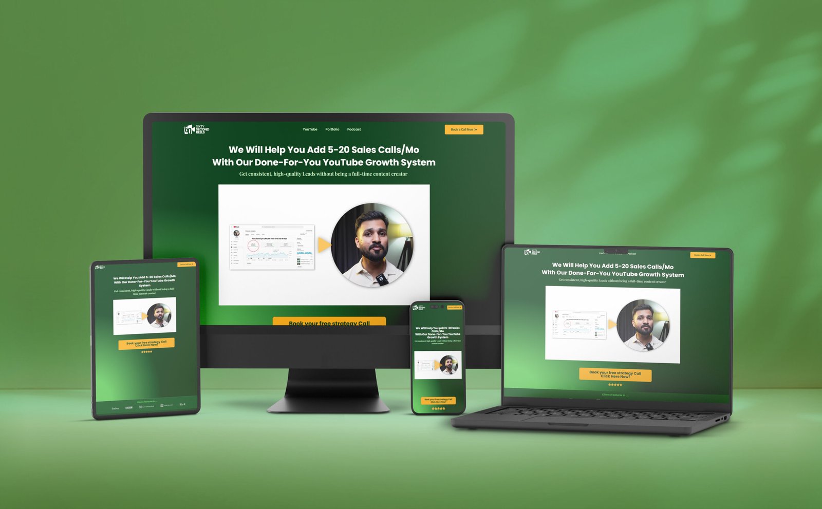
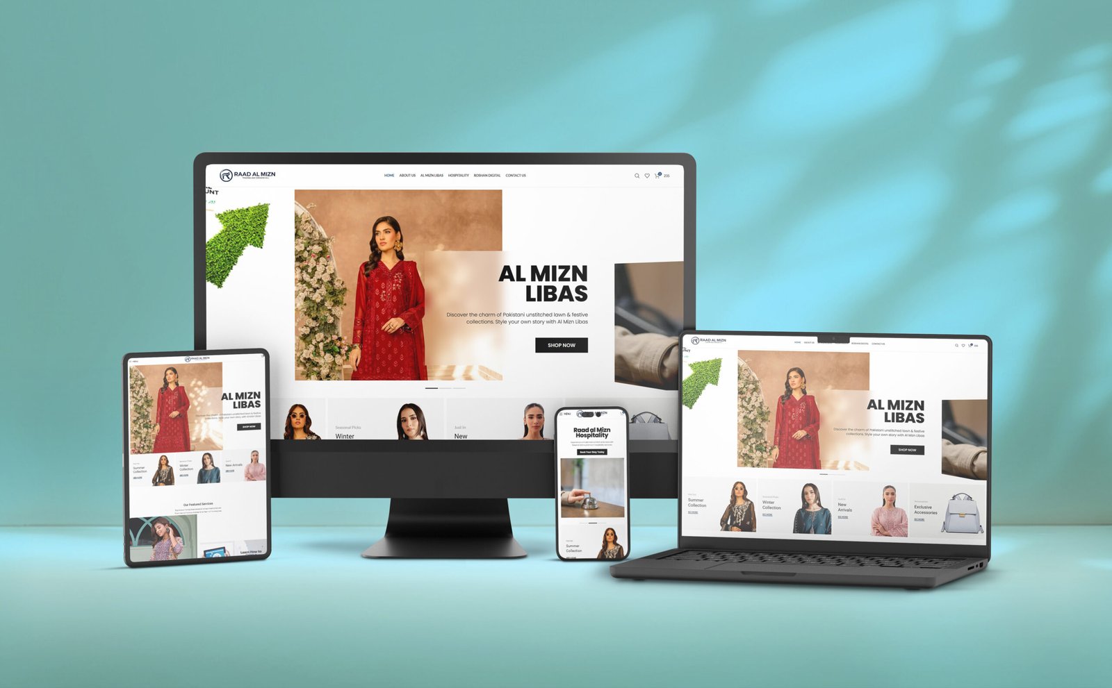
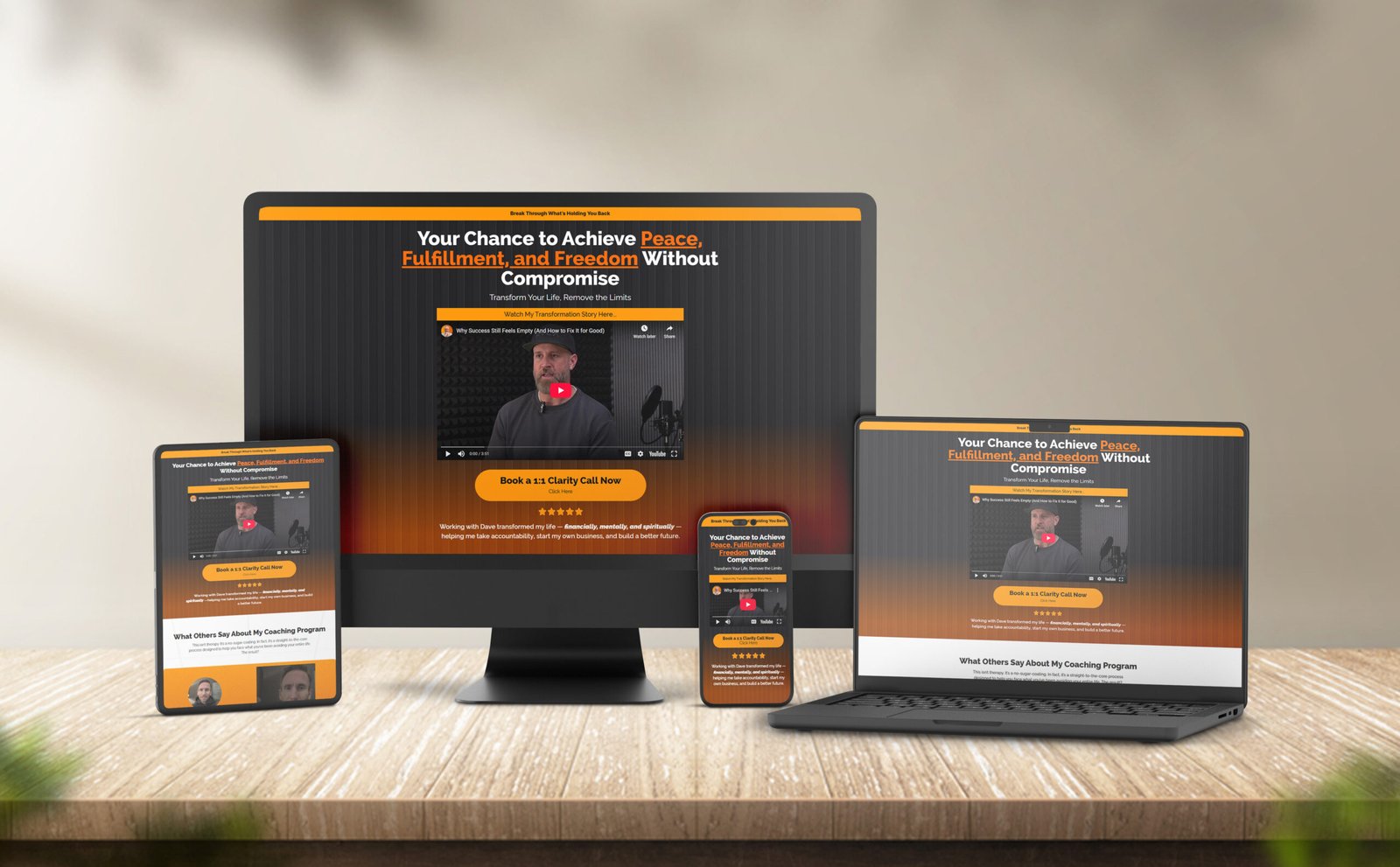
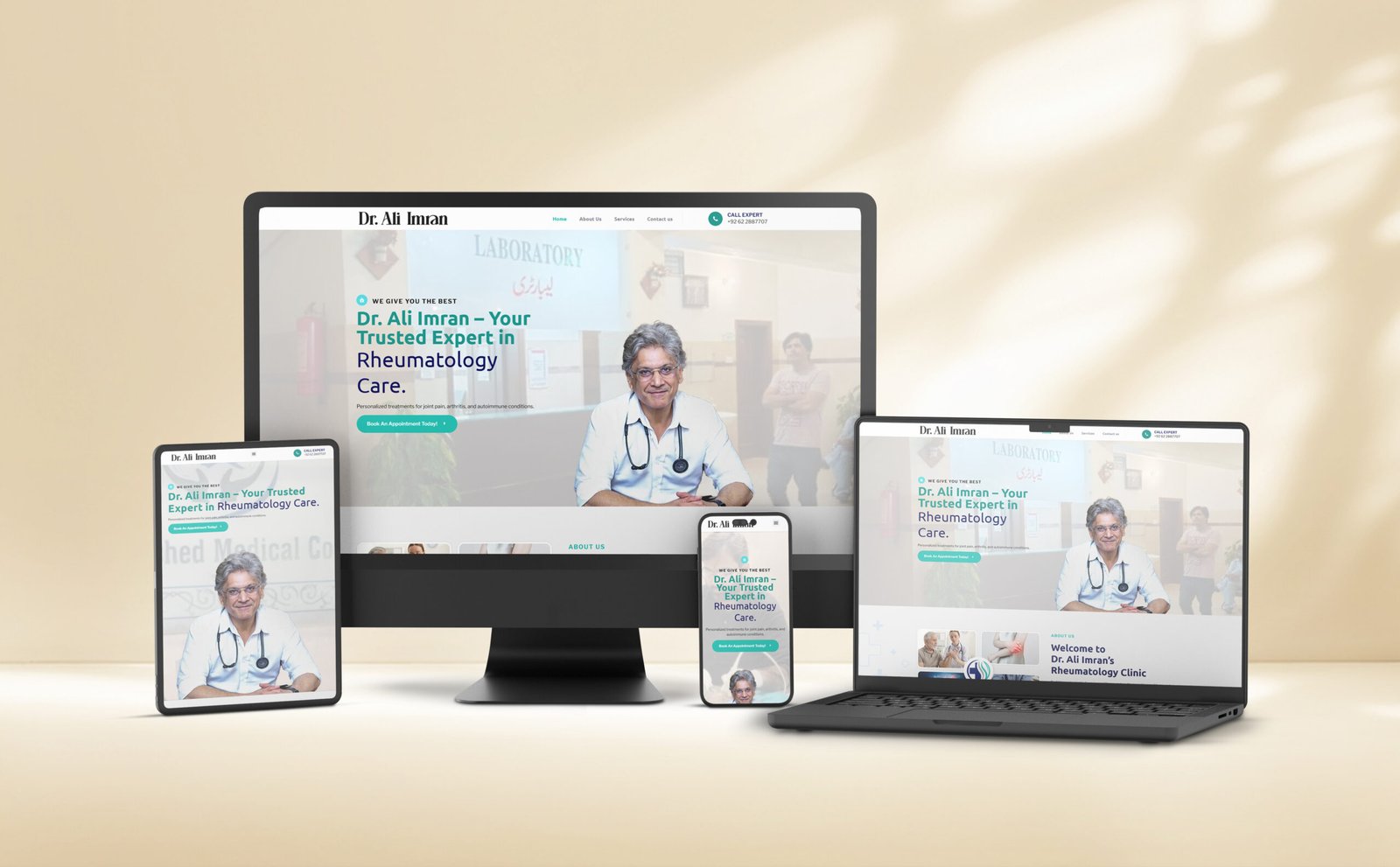
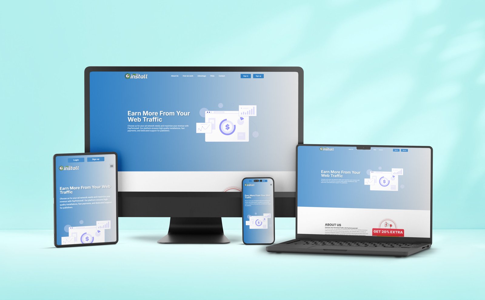
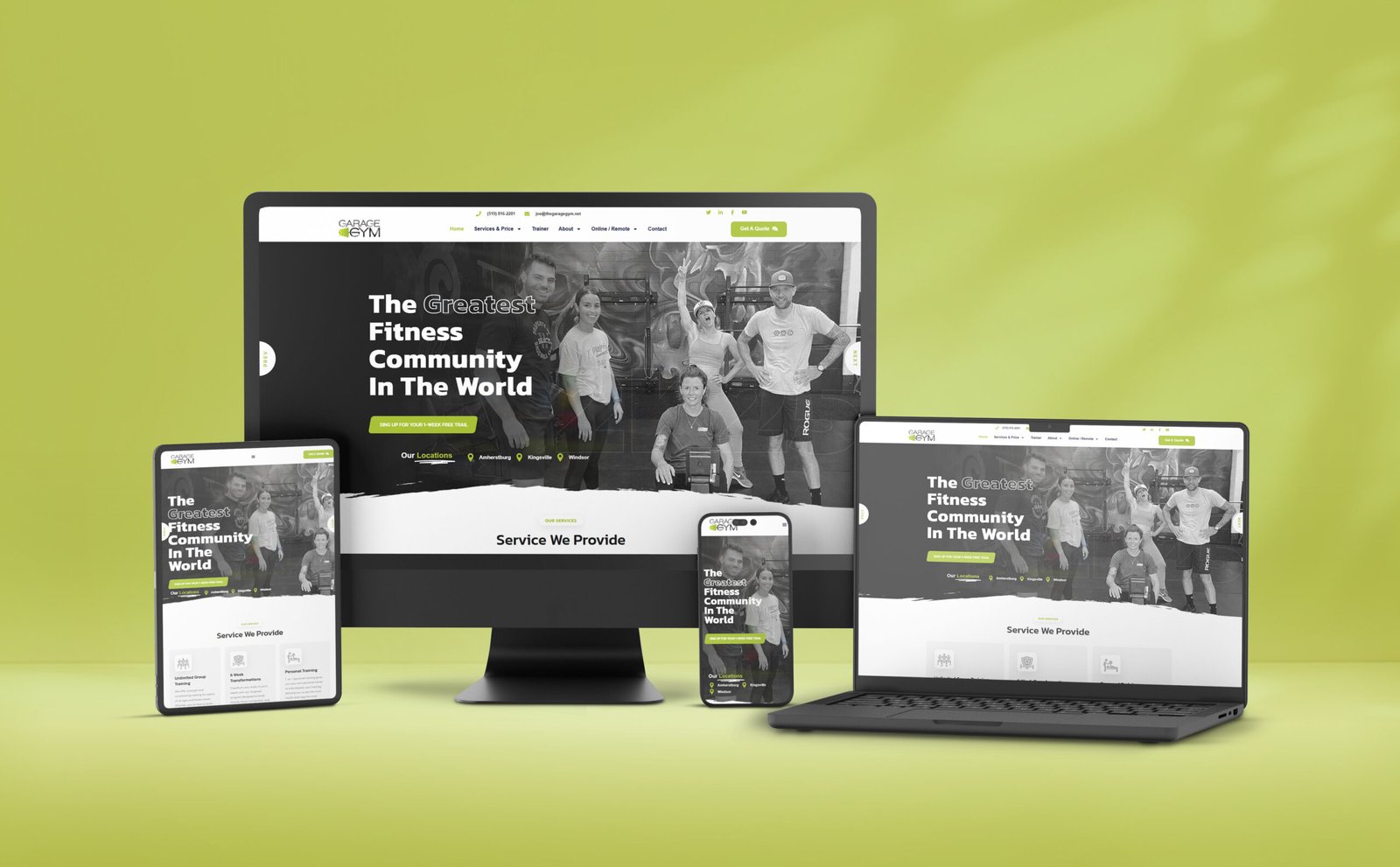
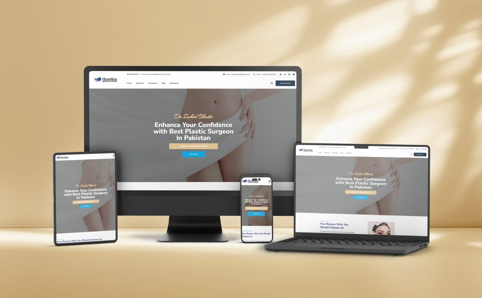
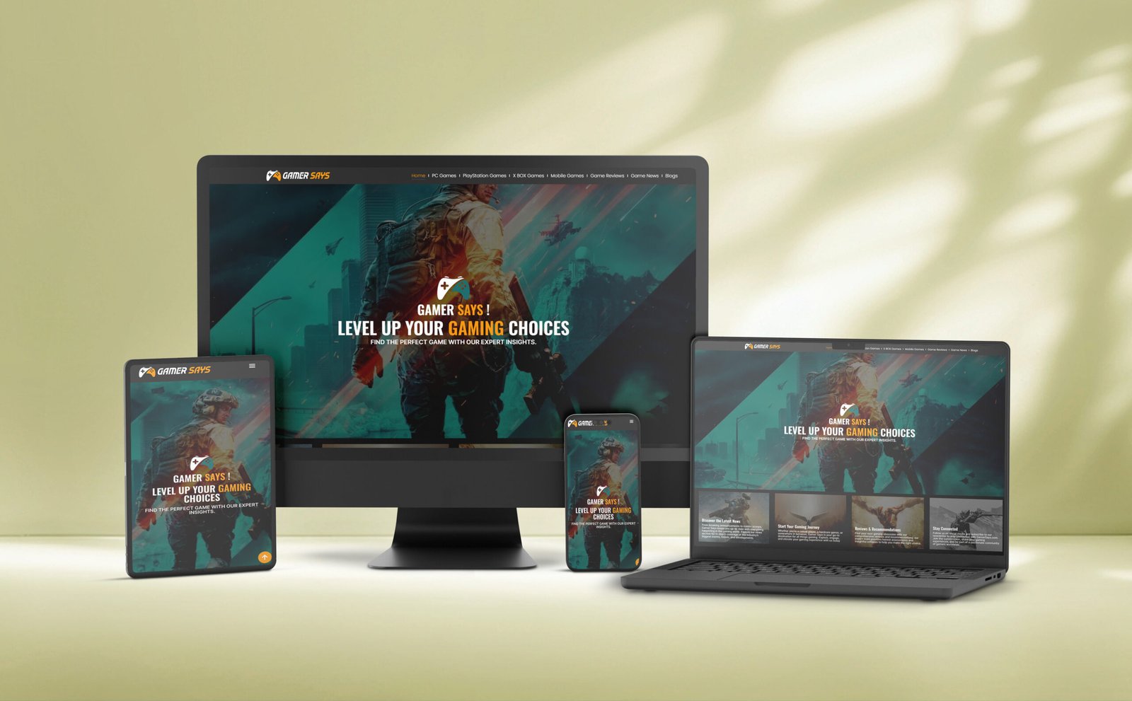
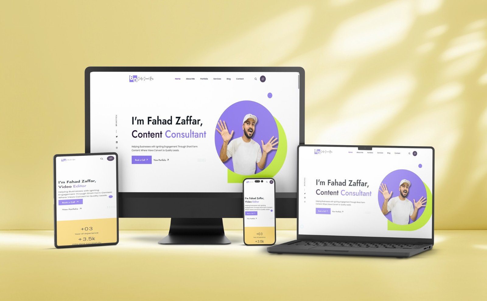
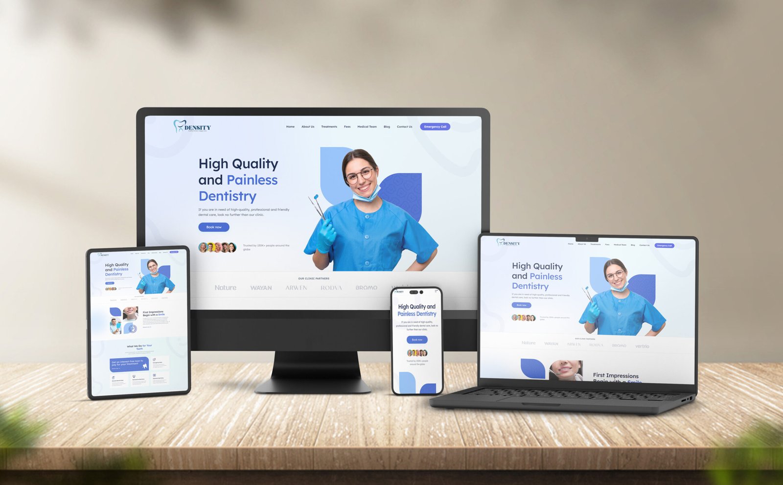
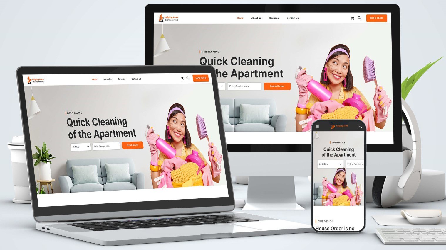
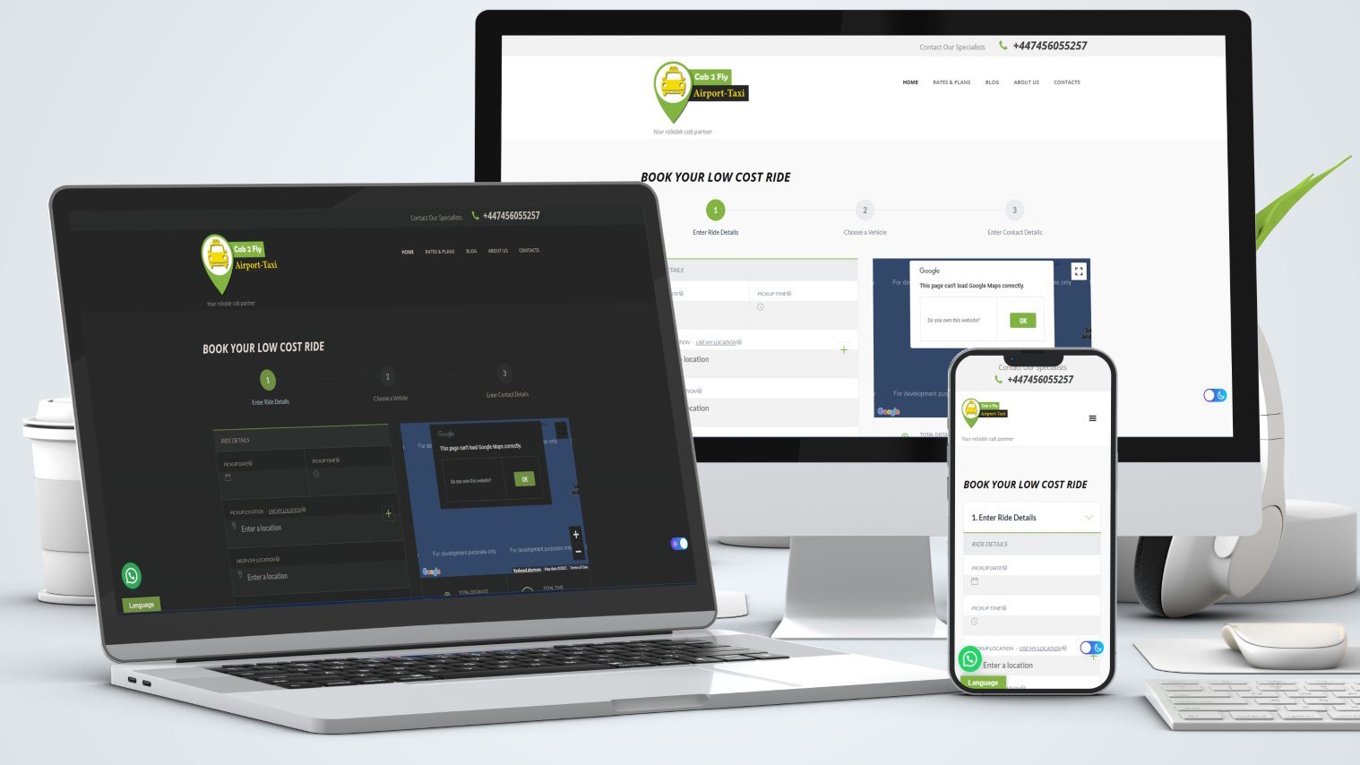
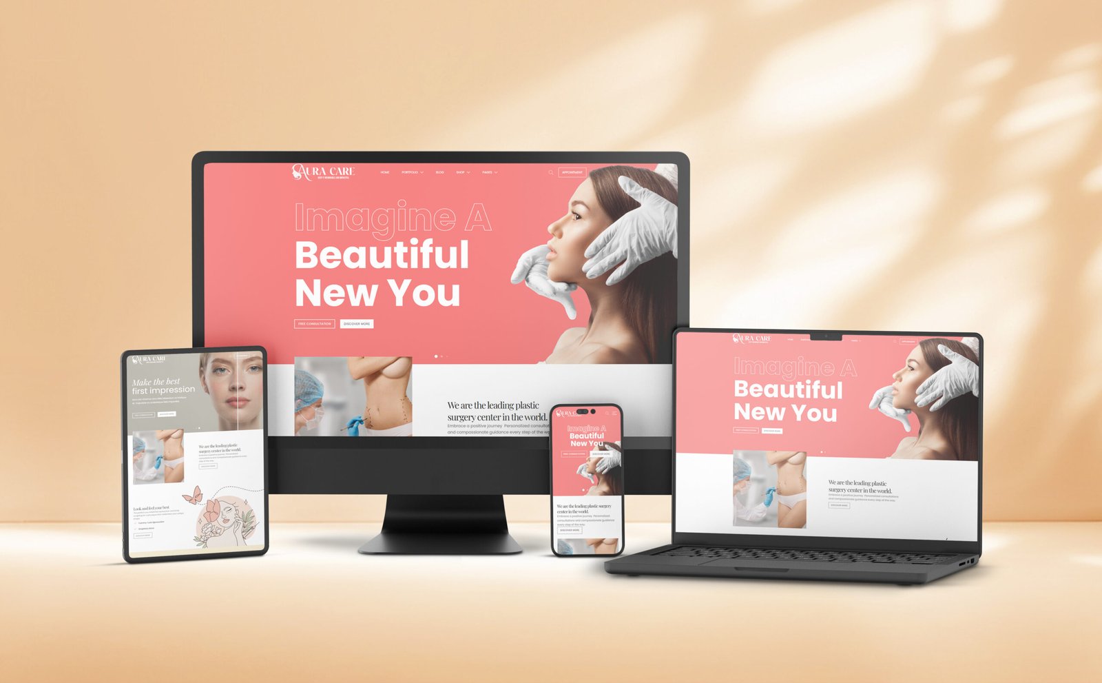
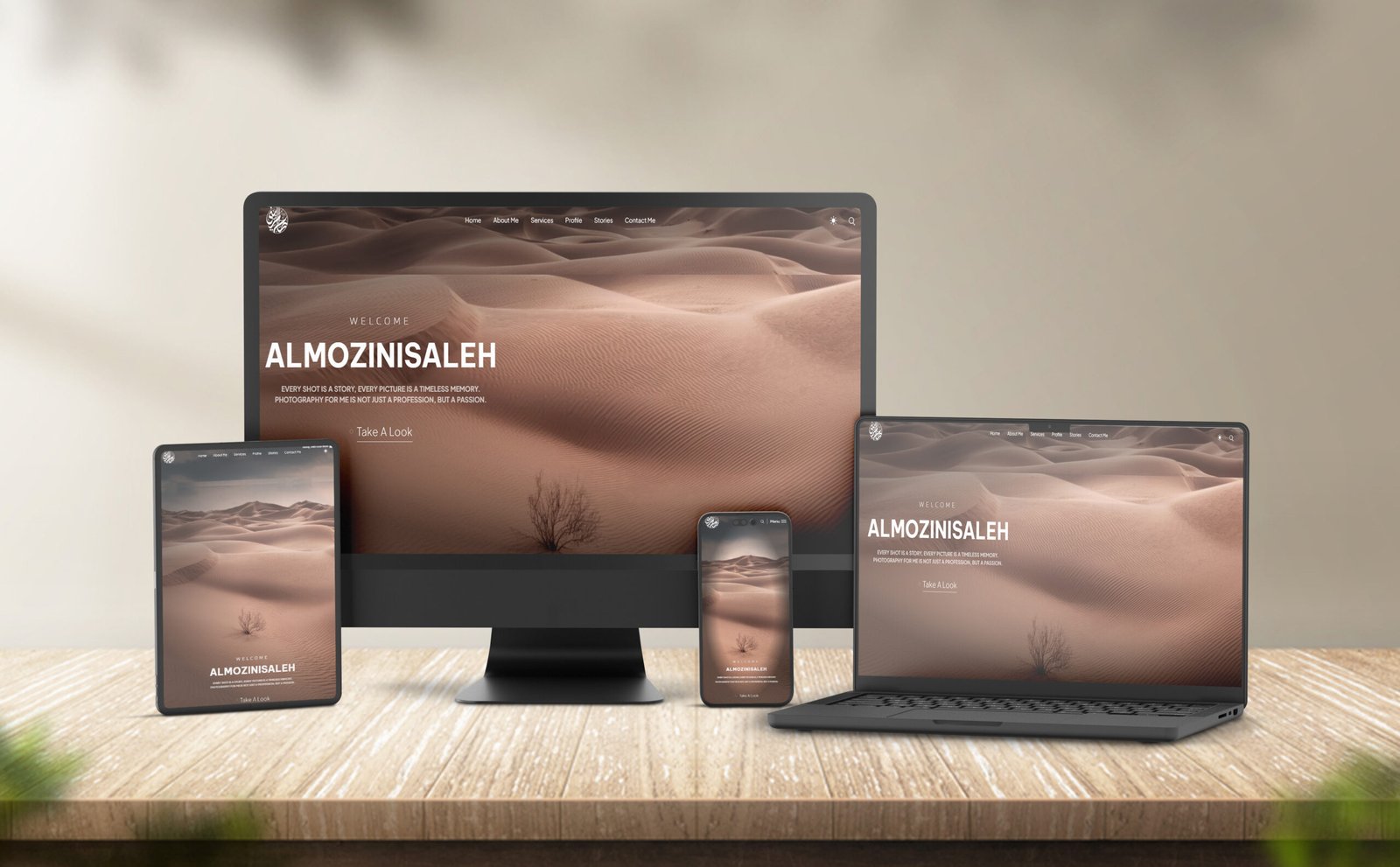
In today’s mobile-first world, your Responsive Website Design must look and work flawlessly across all devices—from desktops and laptops to tablets and smartphones. With this service, I’ll design or redesign your website to be fully responsive, ensuring your layout, typography, images, and buttons automatically adjust for a seamless user experience on any screen size.
Ideal for business owners, medical professionals, bloggers, and service providers who want to improve user engagement and reduce bounce rates on mobile devices.
What’s Included in Responsive Website Design Service
-
Mobile, tablet, and desktop responsive layout
-
Fluid grid and flexible image setup
-
Touch-friendly design (buttons, navigation, forms)
-
Cross-browser compatibility (Chrome, Safari, Firefox, Edge)
-
Optimization for different screen resolutions
-
Mobile-first performance improvements (loading speed, layout shifts)
-
Testing across real devices and emulators
-
Responsive fixes for existing websites (optional)
What’s Not Included
- New website design from scratch (available as a separate service)
- Website development if only design is requested
- Hosting/domain setup
- Advanced mobile-specific features (e.g., Progressive Web App, AMP)
Price Range for Responsive Website Design
💰 PKR 30,000 – PKR 90,000 (or USD $120 – $350)
Depends on the number of pages and whether it’s a redesign or a new design.
Duration
⏱️ 3 to 7 working days
Delivery time may vary based on page count and complexity.
Other Information
- Compatible with all major devices and screen sizes
- Service applies to both WordPress and static/custom-coded sites
- Add-ons available:
• Speed optimization
• Mobile menu redesign
• Sticky headers and mobile-friendly navigation
• UI/UX improvements for mobile experience