

Category
Website Development


Clients
Demo Project


Location
Pakistan


Published on
06/10/2024


Project URL


Project Duration
33 days
Follow us Social Media
Fiverr
Programming & Tech


Hafiz Umar Bhatti
top-notch quality.
Problem Statement
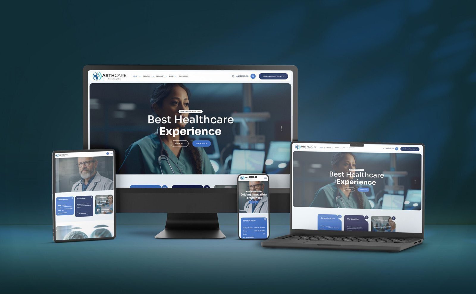
ARTHCARE, a healthcare provider focused on offering advanced medical services, required a professional and responsive website to communicate its brand’s message effectively. The website needed to:
- Establish trust with patients by showcasing its modern healthcare approach.
- Provide clear and accessible information about services, scheduling, and appointments.
- Enable easy navigation and an intuitive user experience for all visitors, especially across mobile and desktop platforms.
- Reflect the expertise and reliability of their healthcare team while maintaining a clean and visually appealing design.
The challenge was to create a digital presence that not only built credibility but also simplified the user journey from learning about services to booking appointments.
Solution Overview
We developed a sleek and fully responsive website with a focus on user experience and visual clarity. The solution was divided into several key sections to address ARTHCARE’s needs:
1. Responsive and Adaptive Design
Given the diverse range of devices patients use to access healthcare information, the ARTHCARE website needed to be fully responsive.
- Challenge: Ensuring a consistent and high-quality user experience across desktops, tablets, and mobile phones.
- Solution: We implemented a responsive design that adjusts smoothly to different screen sizes. The use of flexible grids and high-resolution images ensures that the content remains clear and legible, offering a professional experience on all devices.
2. User-Friendly Interface and Navigation
ARTHCAREHealthcare websites must present information clearly while allowing visitors to navigate easily between sections. Patients need to quickly find details such as services, scheduling hours, and contact options.
- Challenge: Designing a layout that is both professional and easy to use, with clearly defined paths for different types of users (patients, medical professionals, etc.).
- Solution: The main navigation menu is clean and simple, with key sections such as “About Us,” “Services,” “Blog,” and “Contact.” Calls-to-action like “Make an Appointment” and “Contact Us” are placed prominently to encourage patient engagement.
3. Clear Display of Services and Scheduling Information
Patients often visit ARTHCARE healthcare websites for information about available services, opening hours, and locations. Ensuring that this information is easy to find was a top priority.
- Challenge: Organizing large amounts of information without overwhelming the user.
- Solution: We created dedicated sections for scheduling hours, service details, and clinic locations. A clean layout with clear headings and relevant icons was used to break down this information into digestible pieces. The “Make an Appointment” button was strategically positioned to streamline patient access.
4. A Modern, Trustworthy Visual Aesthetic
To establish ARTHCARE’s brand as a reliable and modern healthcare provider, the website needed to feature a clean and professional look that reflected the organization’s values and capabilities.
- Challenge: Balancing a visually modern aesthetic with healthcare-specific needs such as professionalism, trust, and ease of access.
- Solution: A modern color scheme, professional imagery, and intuitive typography were combined to build an inviting yet authoritative visual presence. High-quality photos of medical professionals and facilities were integrated to create a trustworthy connection with visitors.
5. Enhanced Patient Interaction
One of ARTHCARE’s goals was to make it easy for patients to reach out for appointments or queries. This required a clear and effective communication mechanism on the website.
- Challenge: Simplifying the communication process between the clinic and patients while maintaining a professional tone.
- Solution: A streamlined contact form was added to facilitate quick communication. The integration of appointment scheduling directly on the homepage allows for instant interaction. Social media icons and phone numbers are also easily accessible for further convenience.
Conclusion
The ARTHCARE website serves as a comprehensive digital platform for a healthcare provider looking to modernize its online presence. With responsive design, easy navigation, and a modern aesthetic, the website effectively communicates the brand’s mission and values while improving patient engagement and accessibility.


Designing Process


Empathize
Empathy is the key to understanding users’ needs, and ensuring solutions are both meaningful and impactful.


Define
Defining is about distilling insights into clear, actionable problem statements that guide the creation of effective solutions.




Ideate
In the ideation phase, creativity flows as diverse ideas are generated, pushing the boundaries to discover innovative solutions.




Design
In the design phase, ideas take shape as concepts are transformed into tangible, user-centered solutions through iterative refinement



Test
Designs are evaluated through user feedback and real-world interaction, ensuring they meet needs and function as intended.
