

Category
Graphic Design


Clients
Dr Zahid Iqbal


Location
Gujrat, Pakistan


Published on
04/06/2024


Project URL


Project Duration
2 days
Follow us Social Media
Fiverr
Programming & Tech


Hafiz Umar Bhatti
top-notch quality.
Problem Statement for Derma Filler Banner
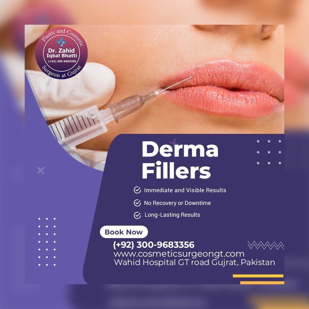
Dr. Zahid Iqbal Bhatti, a plastic and cosmetic surgeon in Gujrat, wanted to promote his Derma Filler services to patients seeking non-invasive cosmetic enhancements. His goal was to attract potential clients by showcasing the benefits of dermal fillers—such as immediate results and minimal downtime—while building trust and encouraging people to book appointments. The challenge was designing a visually striking and informative banner, prompting viewers to take quick action.
Solutions
- Visual Appeal and Relevant Imagery:
- A close-up image of a lip injection was used to instantly convey the service, connecting with potential clients interested in facial enhancements.
- The focus on natural-looking results helps evoke trust and relatability.
- Concise and Persuasive Messaging:
- Bullet points highlight key advantages of derma fillers:
- Immediate and Visible Results
- No Recovery or Downtime
- Long-Lasting Results
- This direct approach answers common concerns and emphasizes convenience, making the service appealing to busy individuals.
- Bullet points highlight key advantages of derma fillers:
- Brand Identity and Authority Building:
- Dr. Zahid’s name, title, and specialization are displayed prominently within the badge, establishing credibility and trust.
- Including the clinic’s location and contact details ensures accessibility for the audience.
- Effective Call-to-Action (CTA):
- The “Book Now” button, along with the phone number and website, simplifies the process for potential patients to schedule appointments.
- Color Palette and Design Elements:
- The purple theme signifies luxury and professionalism, aligning with the cosmetic nature of the service.
- Minimalistic shapes and patterns maintain visual balance and avoid clutter.
- Outcome and Impact:
- This banner communicates the essence of the service effectively while providing all the essential information.
- It grabs attention, builds credibility, and encourages people to take action, driving patient inquiries and bookings.


Designing Process

Empathize
Empathy is the key to understanding users’ needs, and ensuring solutions are both meaningful and impactful.


Define
Defining is about distilling insights into clear, actionable problem statements that guide the creation of effective solutions.


Ideate
In the ideation phase, creativity flows as diverse ideas are generated, pushing the boundaries to discover innovative solutions.



Design
In the design phase, ideas take shape as concepts are transformed into tangible, user-centered solutions through iterative refinement



Test
Designs are evaluated through user feedback and real-world interaction, ensuring they meet needs and function as intended.
